Category Archives: paint

Brand New Coat

Unlike me, my living room walls are sporting a brand new coat this autumn.

We finally committed to a paint shade – Glidden’s Water Chestnut, a soft cream-beige I discovered on Young House Love – and broke out the brushes a few weekends ago.

Every time I paint, I go through the same roller coaster of emotions and this time was no different. First, there’s utter confusion about choosing a color, then elation upon making a choice and realizing we’re finally moving forward. Next, brief panic after seeing the paint first hit the walls (you know how paint always appears lighter when wet? Well, when wet, our new color matched our old paint color exactly), and major relief upon realizing the end result is better, not worse.

Before

After

And finally, a bit of disappointment after moving the furniture back in place and realizing that the room still looks pretty similar.

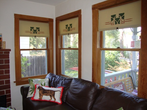
All of a sudden, I worried that things looked too dark, that there were too many competing dark colors – blues, reds, greens, browns. This sparked a mad urge to tear out our old roller shades, swap the chunky coffee table out for something smaller and cozier, get a lighter rug and furniture and buy a big ol’ mirror for over the fireplace in hopes of giving the illusion of a more spacious room.

Fortunately, my boyfriend was able to talk me out of doing anything drastic. We decided to focus our energy on improving the lighting situation and adding details like crown molding, and then assess what our next move should be. That’s fine by me – I’ve been itching to tear out that god-awful cheapo fan (our only source of living room light) since the moment we toured our house.

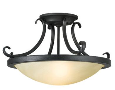
Lighting has always been too spare in here, so we’re going to try a semi-flush mount pendant with two bulbs to hopefully reflect light up and out.  Something like this lamp from Feiss.

Though if our ceiling (and budget) wasn’t so low, it might be fun to get a little crazy and try a vintage style chandelier, or one of the new sophisticated drum lights like this guy.

As for illuminating those dark corners, we briefly considered sconces on either side of the mantel, but decided against tearing into those walls. Now our options seem to be recessed lights in four corners of the room, or possibly just one or two new standing lamps. I’m crossing my fingers that we don’t have to go with the canned…

3 Comments

Filed under home improvement, living room, paint

Color Collection

I think I have a problem.

I seem to be addicted to paint swatches. Which would be fine if I were a painter or interior decorator – but I’m most definitely not.

On the way to the grocery store or post office, I find myself swinging by Home Depot or the hardware store more and more often. Before I know it, I’m carrying out a fresh stack of color. I almost wish they charged a few cents per swatch – the fact that they’re free makes it too easy. I would totally splurge on the full-collection professional paint decks, except I’m afraid that viewing so many options at once would make my head explode. I mean, we only have 51/2 rooms and a hallway.

And you know what the worst part is? After collecting swatches of every color in the rainbow for, like, years, we’re finally going to paint the living room…beige.

1 Comment

Filed under home improvement, interiors, old houses, paint, renovation

True Colors

If these walls could talk, they’d tell me they need some color.

With the exception of a sunny yellow kitchen, the rest of our rooms remain a dingy shade of off-white. Chalk it up to our failure to finish the great popcorn ceiling removal project of 2009 – or my tendency to, ahem, spend more time dreaming than doing when it comes to remodeling.

On the bright side, at least I have plenty of time to settle on colors before we break out the primer – and lately, my interest has veered towards historic paint colors.

Now, I’m not a stickler for historical accuracy – and am not sure I’d like to be bound by strict rules of a historical homeowners association – but honestly, sometimes period paint colors just look and feel right.

Take the soft green 19th Century farmhouse of Stephanie at Our Life on the Hill.

All too often, I think homeowners aren’t sure what to do with their old farmhouses, so they simply paint them white. This is Stephanie’s house before the restoration.


 A white house never goes out of style, but a too stark or neutral color can mask a home’s character and make it look washed out. On the other hand, the Kennebunkport Green and Windham Cream from Benjamin Moore’s Historic Colors Collection, coupled with a pop of burgundy and original clapboard siding (which Stephanie’s husband painstakingly refinished), makes this historic home come alive.

For my own little house, I’m partial to classic arts and crafts shades – especially earth tones like golds and sages. And thanks to Benjamin Moore, Sherwin Williams (pictured below) and California Paints, I can choose from dozens of original shades.


Don’t have a colonial, Victorian or Craftsman? California Paints 20th CenturyColors of America palette devotes much of its swatches to the bright, cheery postwar colors of the 40s, 50s and 60s – like “Hot Tin Roof” red or “Moon Landing” blue (bonus: you can view a biography on each color at the company’s website).


1940-1960 Mid-Century Modern Colors

Like I said, I don’t feel obligated to coat every wall with classic color (though a pastel art deco bathroom would be fun) but I like being able to pick and choose from historic palettes.

What about all you old house enthusiasts out there? Do you want to restore your home to its original painted glory? Or do you prefer to mix it up with modern tones?

6 Comments

Filed under exteriors, paint, restoration